IEIS
What does our Logo Tell?
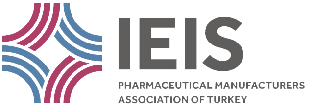 The logo was created by dividing a circle into four and reconfiguring the pieces with the aim of bringing a pill to mind. The aim was that the logo gives the feeling of extroversion, openness to change and dynamics as well as that of steadiness and endurance.
The fact that the circles of the pill are turned outwards symbolizes its attitude of openness to communication with official authorities, doctors, pharmacists and other stakeholders. That the circles are overlapping shows the synergy of the Union with its members. The fact that every piece of the circle has been divided with lines, adds the meaning of plurality. This understanding of plurality shows the variation in fields of activity and production, and the plentitude of the stakeholders in the health sector. The clash and the coming together of the lines expresses the coming together of this plentitude in common goals while the fact that the lines are turned outwards shows the international activities of our members, its capacity for export and their openness to the outer world.
Using this meaning of its design as well as the colors used, with blue showing a healthy and warm attitude, and red showing looking forward, health and movement, we believe that our logo is being associated with strength and trust.
![]() Our 50th anniversary logo is created for refering our accumulated corporate values till today and future-proof aspect. Logo points out IEIS’s rooted and strong vision of the past and the vision towarding the future.
Our 50th anniversary logo is created for refering our accumulated corporate values till today and future-proof aspect. Logo points out IEIS’s rooted and strong vision of the past and the vision towarding the future.
